Sunday 24 June 2012

Paper Range Reviews: Serenity

This collection is called "Serenity" by Bo Bunny. I bought several pagesof this one, as well as the 6" pad. I found it lovely, and very useful as I have a stack of photographs from holidays in Japan to scrapbook. The colours are muted and elegant, and they have generally avoided Japanese and Chinese characters in favour of the patterns and symbols (oriental flowers, bamboo, waves) found in their artwork instead.

I have completed two double-page spreads with this so far. The first spread is really two pages that happened to have the same colour scheme and content, rather than being planned as a spread.

Shrine gate and flowers
(yes, the image has been turned on it's side)

I cut a shrine gate out of black card
to lay over the one on the page

Several flowers were cut out of
the 6" pad to layer with another
flower for detail

Fabric behind the journalling added a nature element to the page
In this second spread, I took the colours in the designs and worked with them to create my own paper patterns from white paper, and then used some of the cut-outs from one of the papers.

The text and bamboo patterns were sprayed or stamped on;
the square with "Serenity" came from the paper range.

Ribbons were used to border photographs, and add detail at corners.
So there it is, the next Paper Range Review. Let me know if there's one you'd like to see put up!

Sunday Scrapping

I was going to write an article about how to set up your scrap room and post some photos showing the different incarnations of my scrap room over the last year, but I was struggling a little for inspiration today and my scrap room is really messy! So I thought I would show you some of the pages I have made today, and then next week I will clean and photograph my scrap room and all my nifty storage ideas. 

Today I decided to play around with texture paste which is a really great way of making things more multidimensional. So far I have only used texture paste to make wood-like effects as per the photo below. However I do think I should experiment with other looks that can be achieved with this great product. 

On this layout I used texture paste to get a 3D wood look, and then dribbled white paint over the wood. I also used buttons and butterflies for interest. Unfortunately my computer is playing up so I haven't been able to add photos to any of todays layouts.

  
I also developed a template and inks addiction at scrap camp (thanks to Jo) and I spent the weekend playing with my new templates and an array of ink colours and glimmer mists. In these two layouts I have been experimenting with inks and mists using the running writing template. 


In the above layout I have inked and sprayed the writing template onto the white paper, then used lilac tissue paper with writing paper over the top. I distressed, inked and curled all the edges on this layout to give it an aged look, then I made a small note-holding pocket to tuck into the back of the papers which I will (eventually!) put some journalling on. When my computer is fixed I am going to print a series of small 2x3 images to go in a photo strip down the brown paper strip.

These two layouts are unfinished but I have been experimenting with a clock motif, using a multitude of different products including stamps and templates. I also embossed the photo mounts with a fleur de lis pattern which I highlighted with gold rub'n buff. In the second layout, the clock was already present on the page so I added the hands using chipboard which I inked brown, and UTEE'd the outside of the clock frame. I also added crackle accents onto the clock hands to give it a nice antique look.


Finally, I completed this layout today. Specific elements of interest are the flower vine which was done in gold utee, and the gold and orange embellishment in the corner. I made this embellishment using the shapabilities range cut onto chipboard and with a pearl brad in the centre.


Hope you like these, let me know if you have any questions!

Monday 18 June 2012

Paper Range Reviews: On The Bright Side

There are a lot of different companies who make paper for scrapbooking, and they bring out and finish printing new ranges of paper all the time. A range of paper is a series of papers which go together, generally having the same colour scheme and topic. This is the first review of a paper range, and it should be noted that even if this particular range goes out of print, there is generally a similar one around, whether it be by the same company or another one.

I liked the On The Bright Side (My Mind's Eyepapers the moment I saw them. They have an easy-going feel to them, with nice colours and a lot of potential. The company describes themselves as "indie chic". They are a series of patterned papers, rather than whole scenes. I found them very easy to work with and match to my photographs because of this. It also made it easier to make pages that were not covered in flowers, as the papers could themselves be used as a point of interest.

Here is a selection of the patterns found in the range:
One side of the papers...
The other side of each paper
Coordinating sticker sheet
A combination of plain cardstock, the denim-blue card
and some strips from the wood-like pattern.
The curls are a loosely quilled strip of card.
The black ribbon was folded at the corners.
The green splotches were made using a shiny spray
close to the card (Tattered Angel's "Glimmer Mist")
I have used these papers to complete 2 pages so far. While I have not used all of the papers, I am enjoying the style they give to a page. The colours blended nicely with some older photographs I had to scrapbook.
Journalling tag, to hide behind the "photo frame"
and look like the photo is hung on the page
A frame effect, created by cutting out a decorative
corner from the same cardstock as the photo mat

Scrap Camp - Handmade by Suzanne

The may camp was fun.

Rochelle and I left Perth on Friday afternoon. We stopped at her house so she could pick up her things and drop off her hubby. I played with the new kitten, who is very energetic. We got to camp around 19:30. Suzanne had saved a plate of food for each of us for dinner.

I got through a lot more layouts this time, a whopping 7 compared to last camp's measly 3. I have to say, I really liked being able to just take with me the patterned paper I wanted to work with, and then buying the appropriate coloured card stock when I was there. Waiting for my bag of stuff to go through the shop also gave me time for the creative juices to flow.
Being autumn, it was freezing at Pinjarra. We felt well-prepared with hot water bottles, rugs (take your own! Never believe someone who says they've got enough for you) and various extremity-covering devices (beanies, socks, gloves).
As one would expect on a camp, the beds were a tad uncomfortable. My mattress was so saggy I was sleeping below the frame, and Rochelle's was so hard it felt like a plank of wood. This made the going slow the next morning, but tasty hot food and the promise of a relaxing day ahead got us up nicely. Saturday was a lovely day outside, although I did not see most of it. The scenery was lovely, and some people took advantage of it; there was a group having a wedding at the village at the same time as the camp.
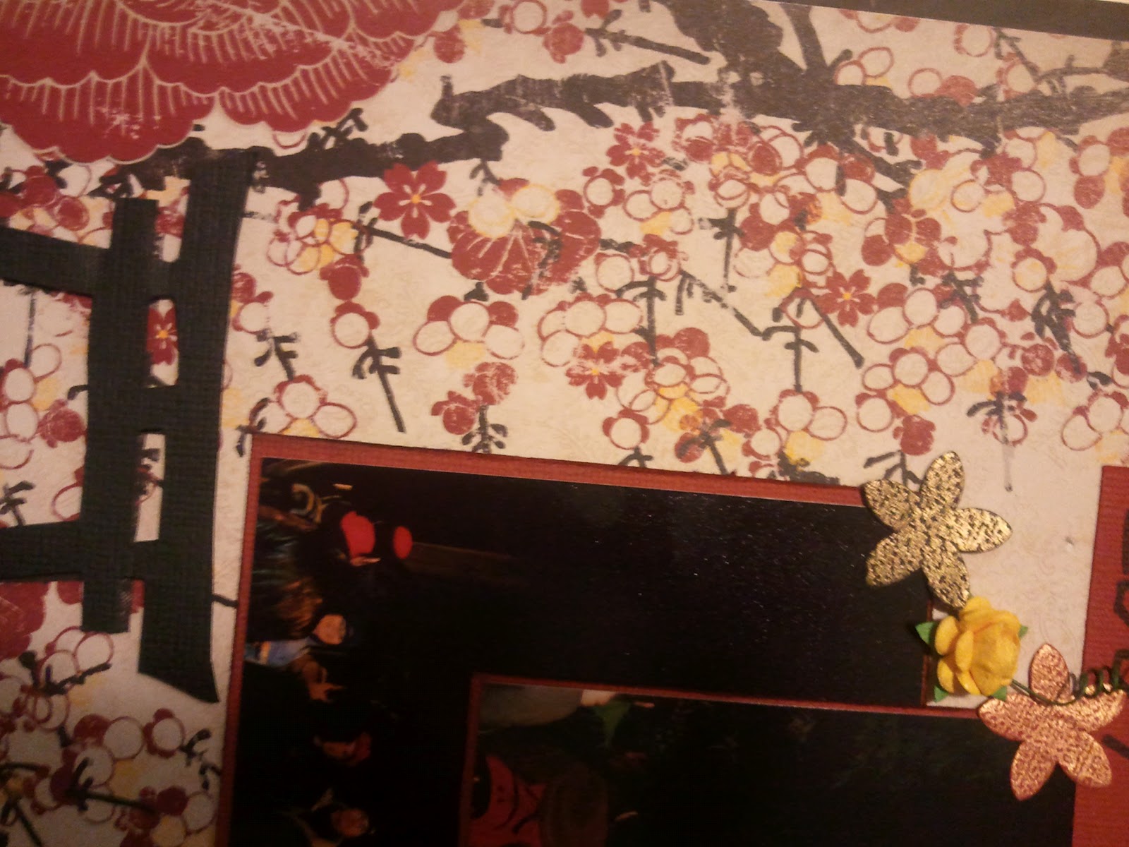
This camp also involved a competition layout. As there were a few day-scrappers, the competition was held on Saturday. It was a sketch that we had to design from. I partook in it, and made a layout based around my partner and a steam-powered clock we found in Vancouver, Canada.
Layout for competition

This was to echo the flowers on the clock in the photograph;
the metallic clockwork was made using UTEE in Rochelle's Melting Pot.
Close up of the other embellishments


To keep me going, I had a nap on Saturday afternoon. I am still unwell from a mystery virus, but recovering slowly. Rochelle and I stayed until the competition had been voted on and the winner was announced, then headed to her place to sleep. We chose the half hour drive with comfortable mattresses and pleasant showers over being able to walk back to the scrapping area; a good choice, I feel.

Sunday showed the importance of a good night's sleep before scrapping. Instead of the 2 layouts I'd completed the night before, I completed 5 layouts in less time on Sunday. I also got the hang of making my own pretty background papers from card stock, using sprays, ink pads and stencils.

All in all, I think I enjoyed this camp more, which I feel was a mix of a cosier venue and no concerns about having to organise my own meals. But probably mostly sleeping at Rochelle's house.

Monday 4 June 2012

Mad Hatter's Tea Party, Perth

On the 10th of March I went to a Mad Hatter's Tea Party in Northbridge. It was hosted at the CNR cafe, which is on the corner of Lake Street and James Street.

The link (if it still works) is here: http://www.showmeperth.com.au/event/mad-hatters-tea-party

After arriving late due to a wardrobe malfunction (there were no wardrobes between the scrap class I'd been attending and the event) I joined my family and partner. The party had taken over the whole lawn, and activities included croquet, giant scrabble (which my family enjoyed immensely), table tennis and badminton.
Croquet game
My family at the scrabble board
Scrabble is so much fun!
The temperature was sweltering (according to the Bureau of Meteorology, it reached 39.5 degrees Celsius (103.1 degrees Fahrenheit). The cafe served iced tea (we suspect it to be Ceylon Orange, with extra tasty bits), and tiny delectables. These included "eat me" cupcakes, sandwiches with the crusts cut off and the latest foodie craze in Perth, macaroons.
A selection of desserts - scone and an "eat me" cupcake
There was a competition for best dressed. The winners were a cheshire cat (we aren't sure how they stopped themselves turning into a puddle), a steampunk bloke with a mechanical ostrich, 3 ladies in purple and red (their costumes were stunning), the Queen of Hearts and the Mad Hatter.

Some of the stunning costumes

I enjoyed the day a lot. The group who put it together can be found here: http://www.thegreatsteampunkaffaire.com/